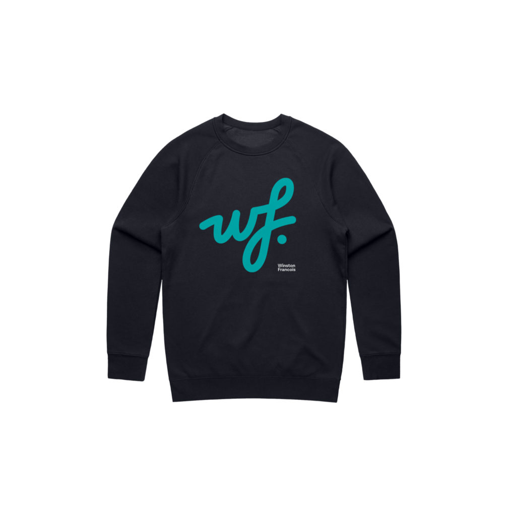
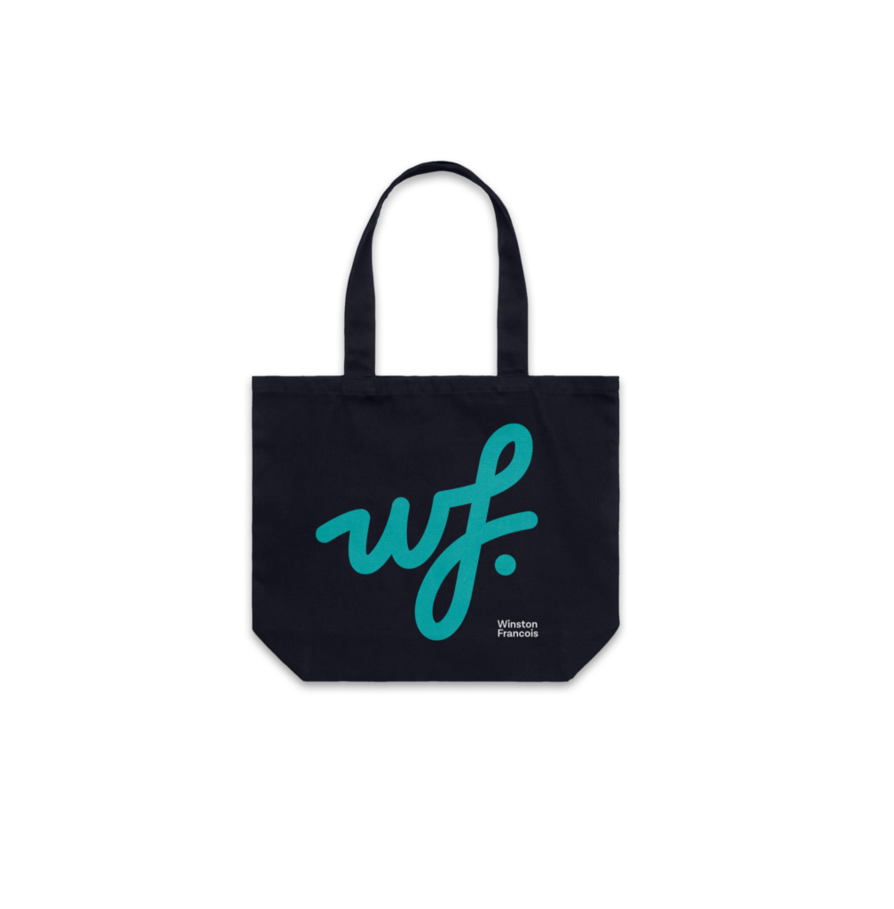
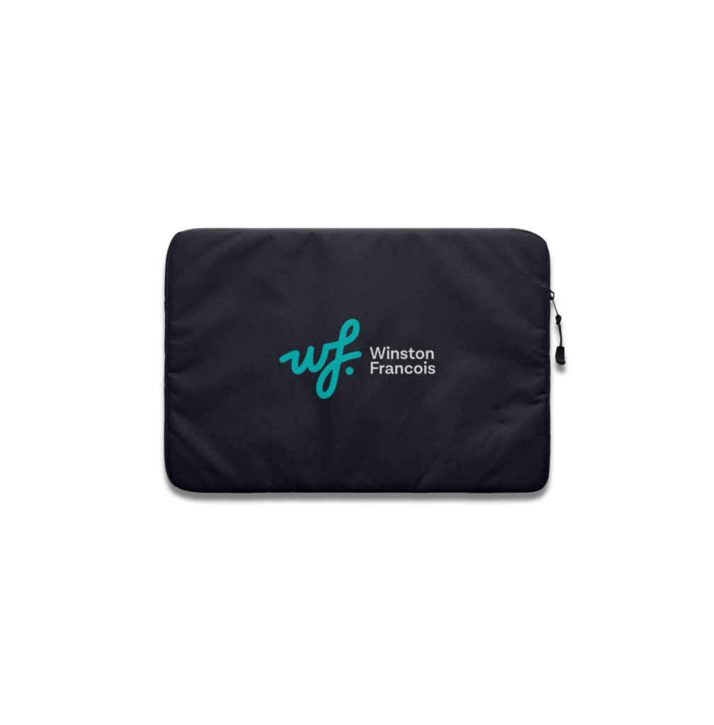
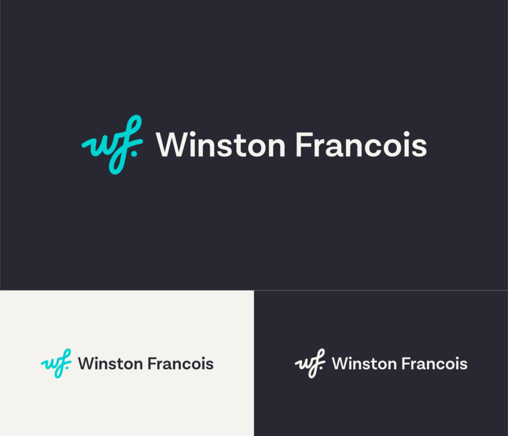
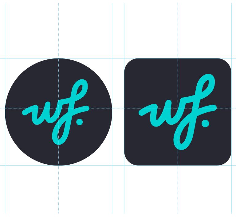
Logo
Our hand-crafted WF signature, communicates growth and successful outcomes. The set of logos includes the stand alone icon, as well as two different logo lockups. There is no primary lockup, and the use of these is determined by its application.
Download Logos
Stacked lockup
This version is comprised of the primary logo and stacked wordmark.
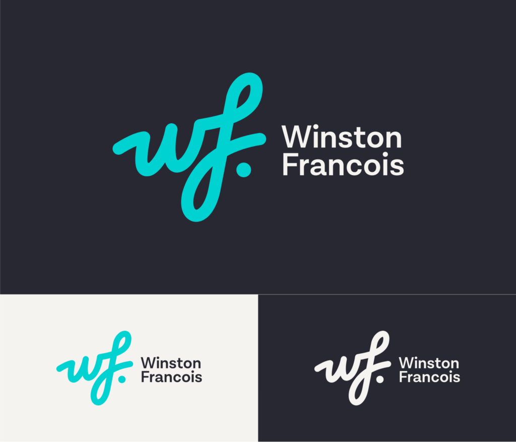
Horizontal lockup
This version is comprised of the primary logo and horizontal wordmark.
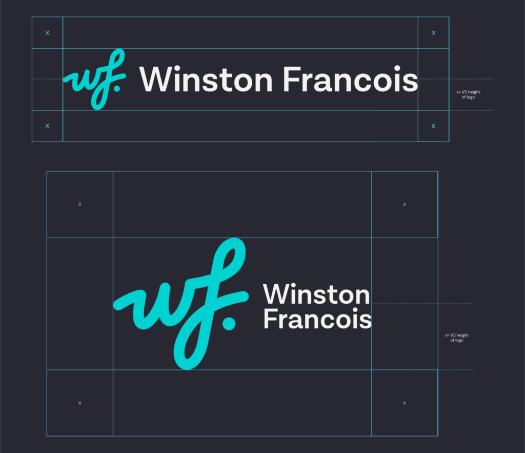
Clear space
The “x” provides a guideline for the clear space required. No other element should intrude into this area and this also applies to positioning the logo at the edge of an item.
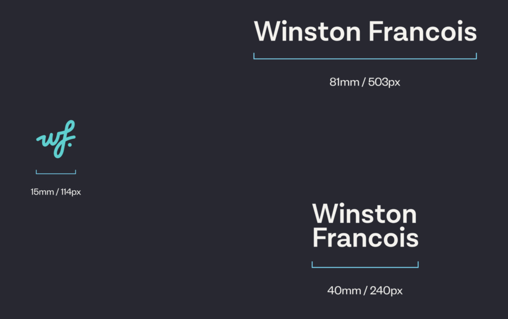
Minimum Sizing
To ensure legibility and accessibility, the Winston Francois logo or icon should never appear smaller than the described sizes.
Logo Uses
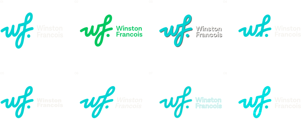
It is important that our logo is always presented in a consistent manner. It should never be altered in a way that is off-brand or in an application that dilutes the brand.
Do not:
- Stretch the logo
- Use a color outside of our palette
- Use drop shadows
- Crop the logo
- Change the typeface
- Distort or skew the logo
- Apply a thick outline
- Fill with texture
It is important that our logo is always presented in a consistent manner. It should never be altered in a way that is off-brand or in an application that dilutes the brand.
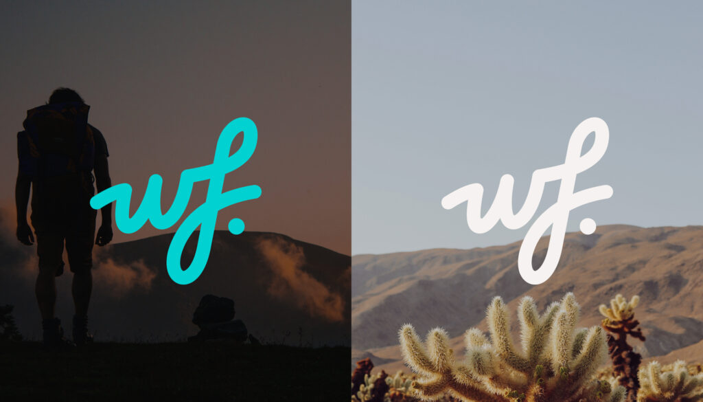
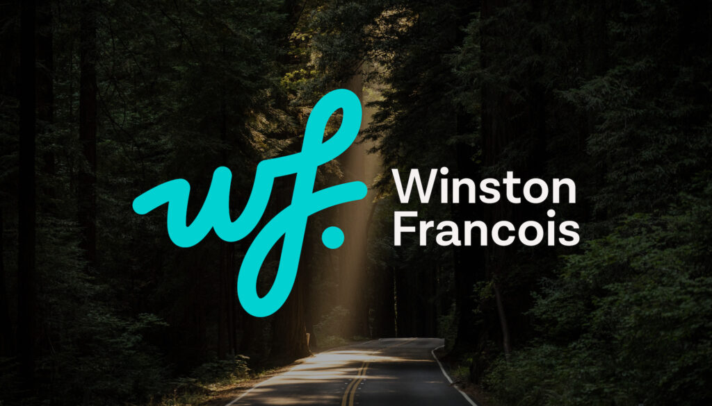
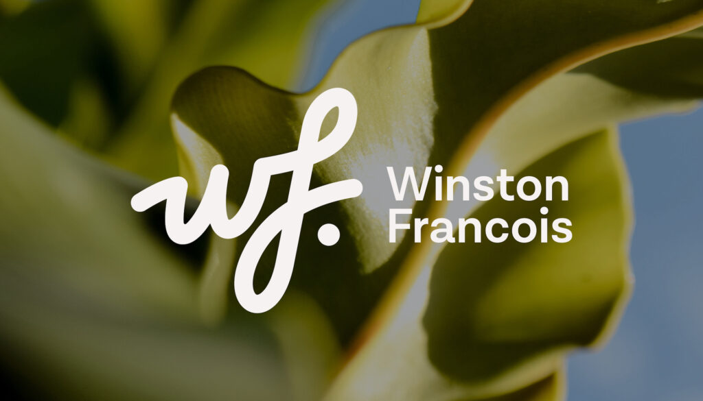
Logo on photography
The logo in Teal is the preference, but cream can be used when visibility or contrast is impacted.
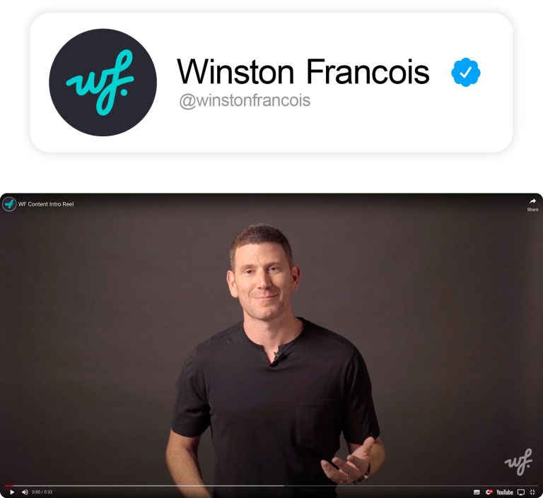
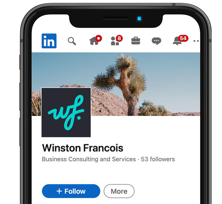


